 So, for the last few days I've been working on transferring my crochet store over from tripod to blogger. I hated all the ads on tripod and how complicated it was to make it look decent. So my friend Amanda made me an adorable banner and matching button in my sidebar, then I put in some pics and descriptions, and added a PayPal shopping cart, and voila! It's done! Well, mostly. I'll get more pics and items up as I go, but the basic store is ready. Go ahead and check it out! Leave me some feedback on what you like or don't like, errors that might pop up, suggestions, etc. I'd love to hear what you think :)
Monday, July 09, 2007
Grand Opening!!!
So, for the last few days I've been working on transferring my crochet store over from tripod to blogger. I hated all the ads on tripod and how complicated it was to make it look decent. So my friend Amanda made me an adorable banner and matching button in my sidebar, then I put in some pics and descriptions, and added a PayPal shopping cart, and voila! It's done! Well, mostly. I'll get more pics and items up as I go, but the basic store is ready. Go ahead and check it out! Leave me some feedback on what you like or don't like, errors that might pop up, suggestions, etc. I'd love to hear what you think :)
Subscribe to:
Post Comments (Atom)
9 comments:
I love the banner, it's super cute. As far as the website, I like the different colors between the details and the price. Maybe even put a space between the two? I love that you have the cart connected to PayPal, that makes it really easy.
I only have a couple ideas, use them if you want. :) When I pulled up the page, it looks like everything is off centered. The four pictures at the top don't seem to go well together because they are different sizes. But I like symmetry and maybe I'm OCD that way. lol
You've done a great job!
LOL Michelle- see that's good to know, cuz I don't know how it looks on other monitors, maybe one day I'll have to come use your computer and work on it. We have a 19" widescreen monitor so sometimes it doesn't look the same on smaller screens.
I know what you mean about that. I'm trying to change my blog to three collumn. It looks great on my pc at home, but when I get to work (smaller screen) it looks horrible. The second sidebar is on the bottom. I don't know if it's something I've done wrong, but I don't want other people to seem my page and think it looks bad. It's hard to change things over b/c you don't know how other people will see it.
I went over and checked out. It looks pretty cool.
Tisha- are you putting your widths in pixels or %s? I had to put mine as % to get it to fit most monitors, since smaller monitors can't fit as many pixels across. Like my sidebars are each 20% and my main post column is 50%, or something.
Looks good from here Kara! I hope you get a lot of business! :)
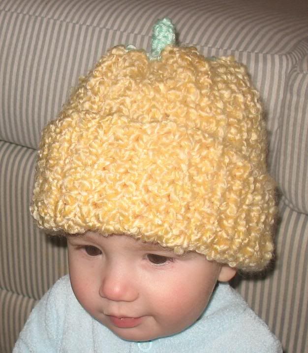
That is an adorable pic! I think your site looks great. Good luck!
So adorable. My son had a crocheted pumpkin set that he wore on his first Halloween. I'll keep it forever! Your site looks great.
Good luck with your new endeavor!
Those are ADORABLE! Just in case you hadn't heard of it, Etsy is a GREAT place to sell handmade stuff. :)
Cara
Kara- everything looks really good!
Post a Comment